
UX/UI case study
My Genesis:REDESIGN
A study and redesign of key features in My Genesis, the companion app for owners of Hyundai’s luxury vehicle brand.
01Overview
The one app Genesis owners rely on
My Genesis gives drivers exclusive features: remote control, vehicle monitoring and maintenance services. Its sleek interface matches the brand, but its usability needed work, especially around remote control.
Because owners can’t replace the app, a smoother flow and a faster interface matter more here than almost anywhere. I focused on the three moments drivers reach for it most.
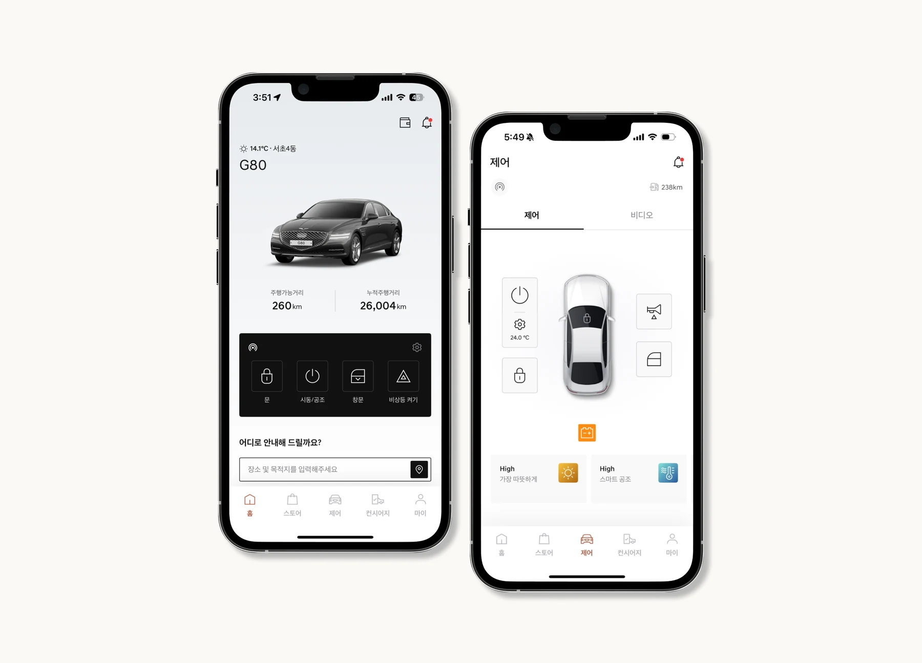
ORIGINAL DESIGN: KEY FEATURES
02Research
What drivers said about the app
I started with public app reviews to find recurring complaints, then ran a survey and a follow-up interview with Genesis owners.
- Pain point 01
Feature Visibility
Navigation is too subtle to spot and unintuitive, and there is no “arrive by” time. Driving Insight leaves out speed and how often drivers braked or accelerated hard.
- Pain point 02
Poor Control Usability
Unlocking the door means holding the button for over a second. Many reviewers found this bothersome and unnecessary.
- Pain point 03
Distractions
Launch animations, ads and a busy home screen get between drivers and the updates they opened the app for.
Survey: seven Genesis owners
Members of an online Genesis owners’ community rated the app’s features from 1 to 5. They value remote control highly, and see real room to improve navigation and maintenance tools.
- Age
- 50s42.9% of owners, then 40s at 28.6%
- Gender
- 85.7%male
- Frequency
- 1–6×a month, for 42.9% of owners
- Where
- 85.7%use it mainly at home
Interview: a GV70 owner
He values Driving Insight most for its at-a-glance distance tracking, but wants more depth.
- Route historySee the actual routes driven, not just distance, like a fitness-tracking app.
- Custom timersSet timers for remote features.
- Scheduled pre-conditioningSet the cabin temperature on a schedule before a drive.
His verdict: the app needs deeper functionality, especially navigation integration and data visualization.
03Define
Framing the problem
The app fails to support drivers who need to prepare their car and check its status quickly, especially around their commute.
streamline vehicle preparation, status checks and remote control for commuters who need quick access before and after they drive?
04Ideate
From Crazy 8’s to a flow
I started with rough sketches of possible solutions, then drew annotated wireframes to explore UI concepts for the home tab and the control panel.
Figure 5Drag, or use the arrows. Select any sketch to enlarge it.
User flow
Mapping every tap for the control panel and the home tab showed where the flow could be shortened.
05Redesign
Two tabs, each with one job
In the original, remote control lived on both the Home and Control screens, which was redundant and confusing. The redesign gives every feature a single home.
Journey tab
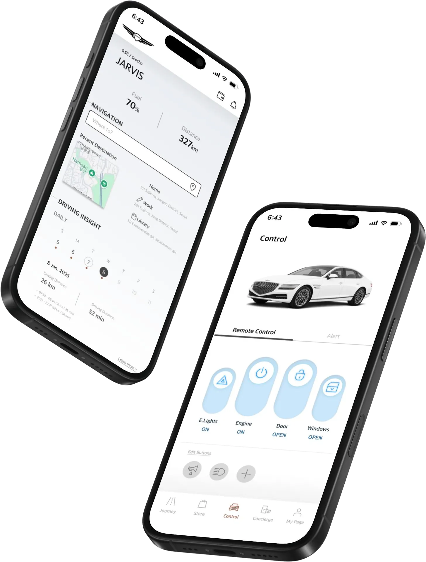
A home screen built for the drive ahead
Scroll to walk through the screen, top to bottom.
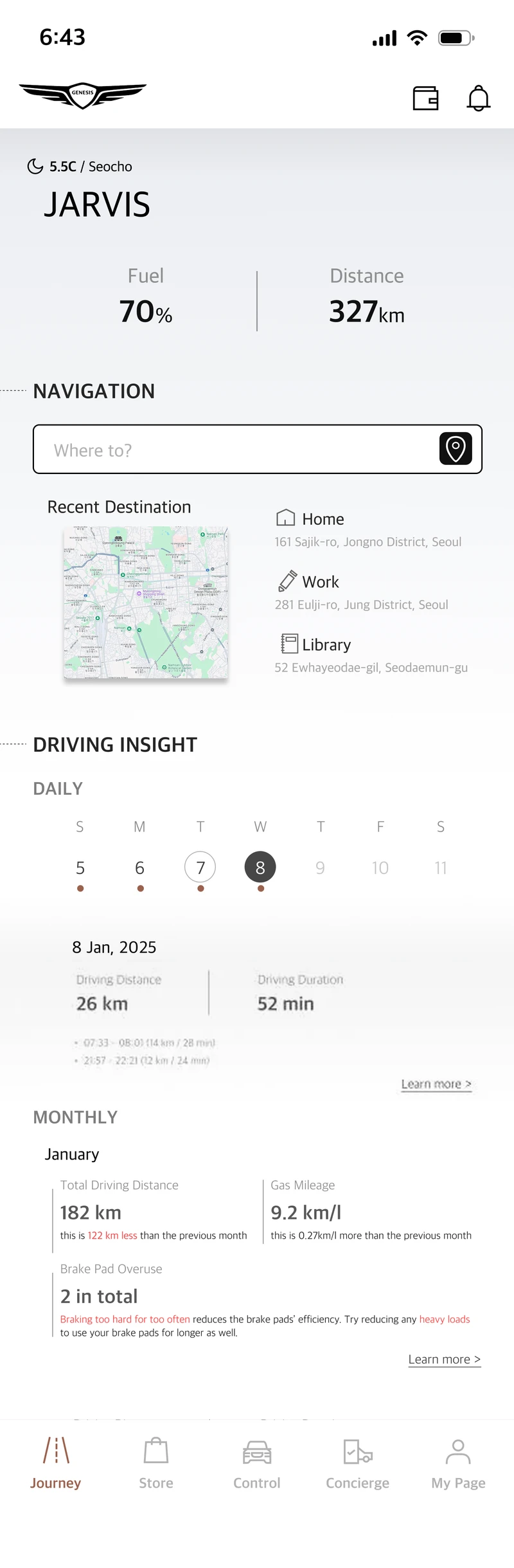
- 01 · Top
Status first, not decoration
The car image served no purpose on this page, so it gives way to what drivers check first: fuel percentage and available range.
- 02 · Navigation
Navigation, laid out like the car’s
Journey follows the vehicle’s own infotainment UI. A clear “Where to?” search sits on top, with recent destinations one tap away.
- 03 · Driving insight
Driving insight, day by day
Pick a day to see its distance and duration. Below, monthly totals track distance, fuel efficiency and brake overuse.
- 04 · Tab bar
Home becomes Journey
The tab is renamed to say what it does: lead drivers to everything about preparing for and finishing a drive.
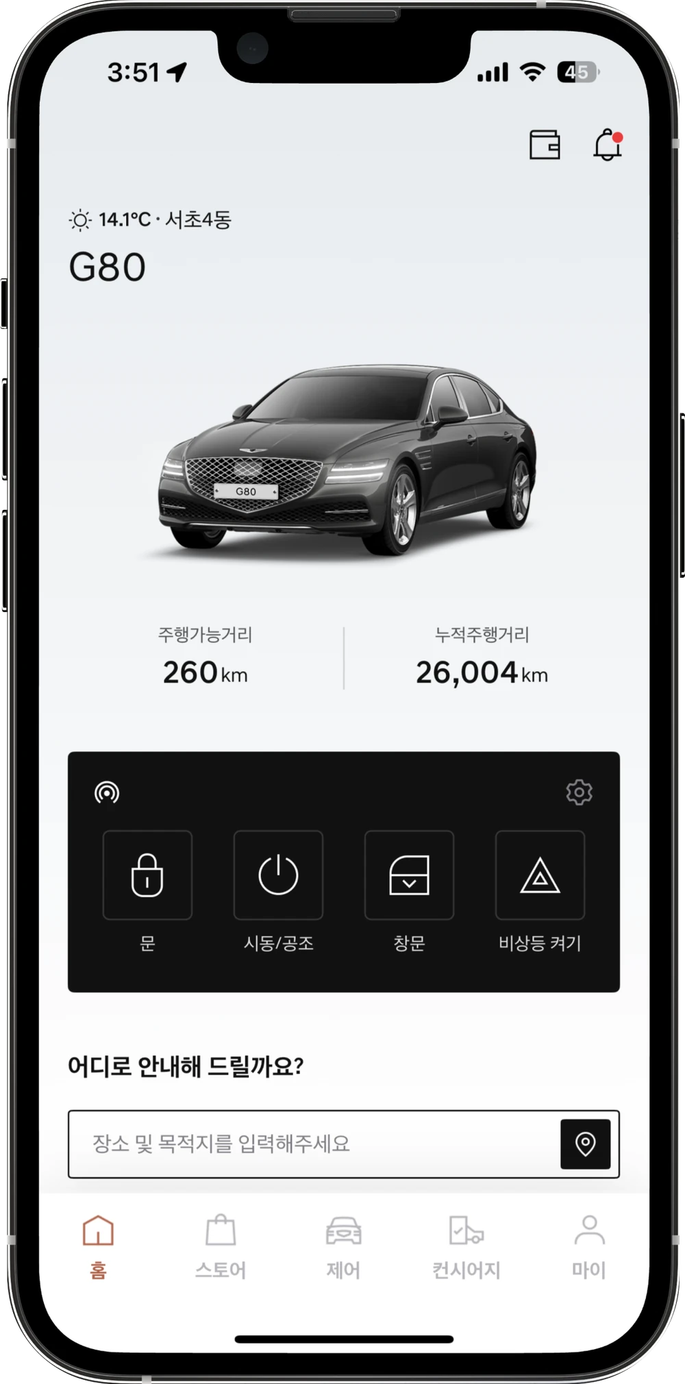
- A large car image with no function
- Remote controls repeated from the Control tab
- Navigation reduced to one small search bar
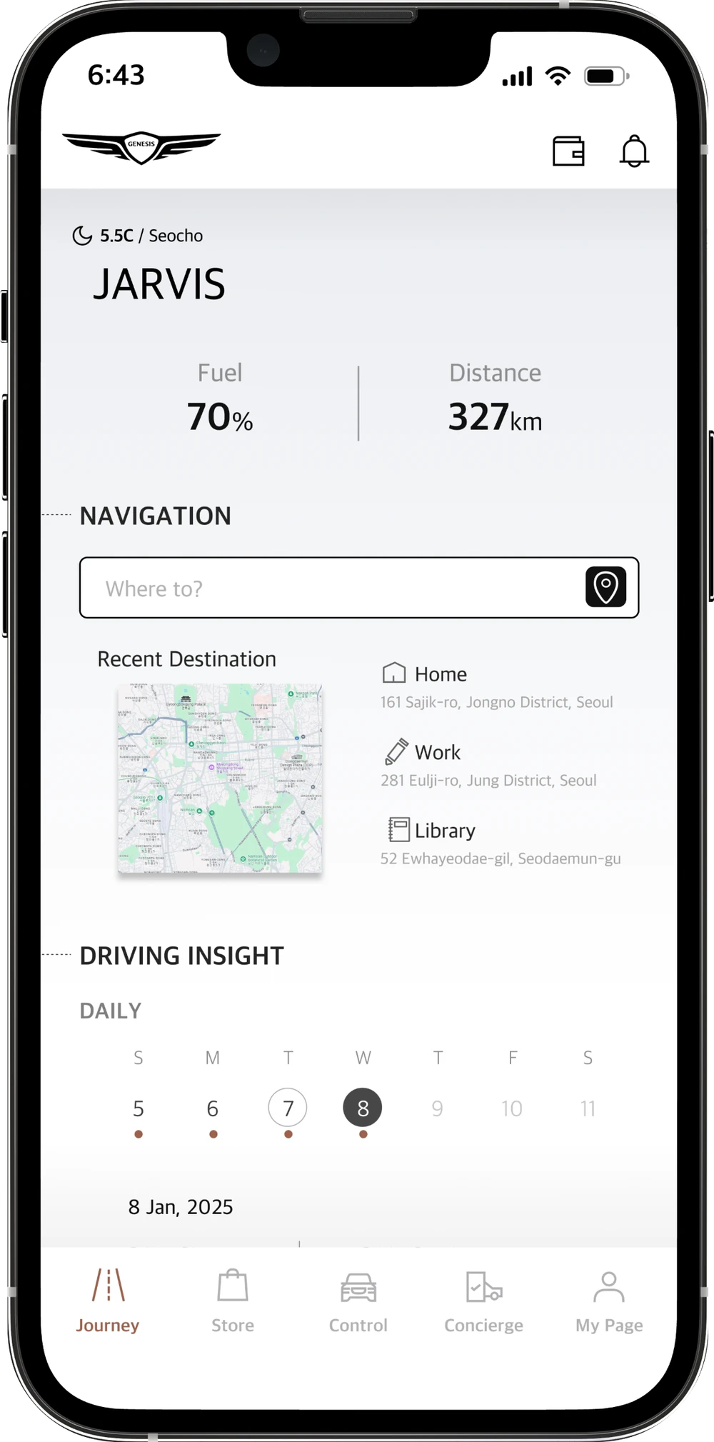
- Fuel and range at the top
- Navigation with recent destinations
- Daily and monthly driving insight
Control tab
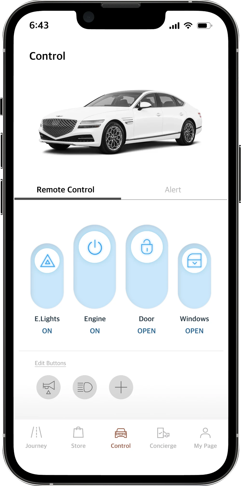
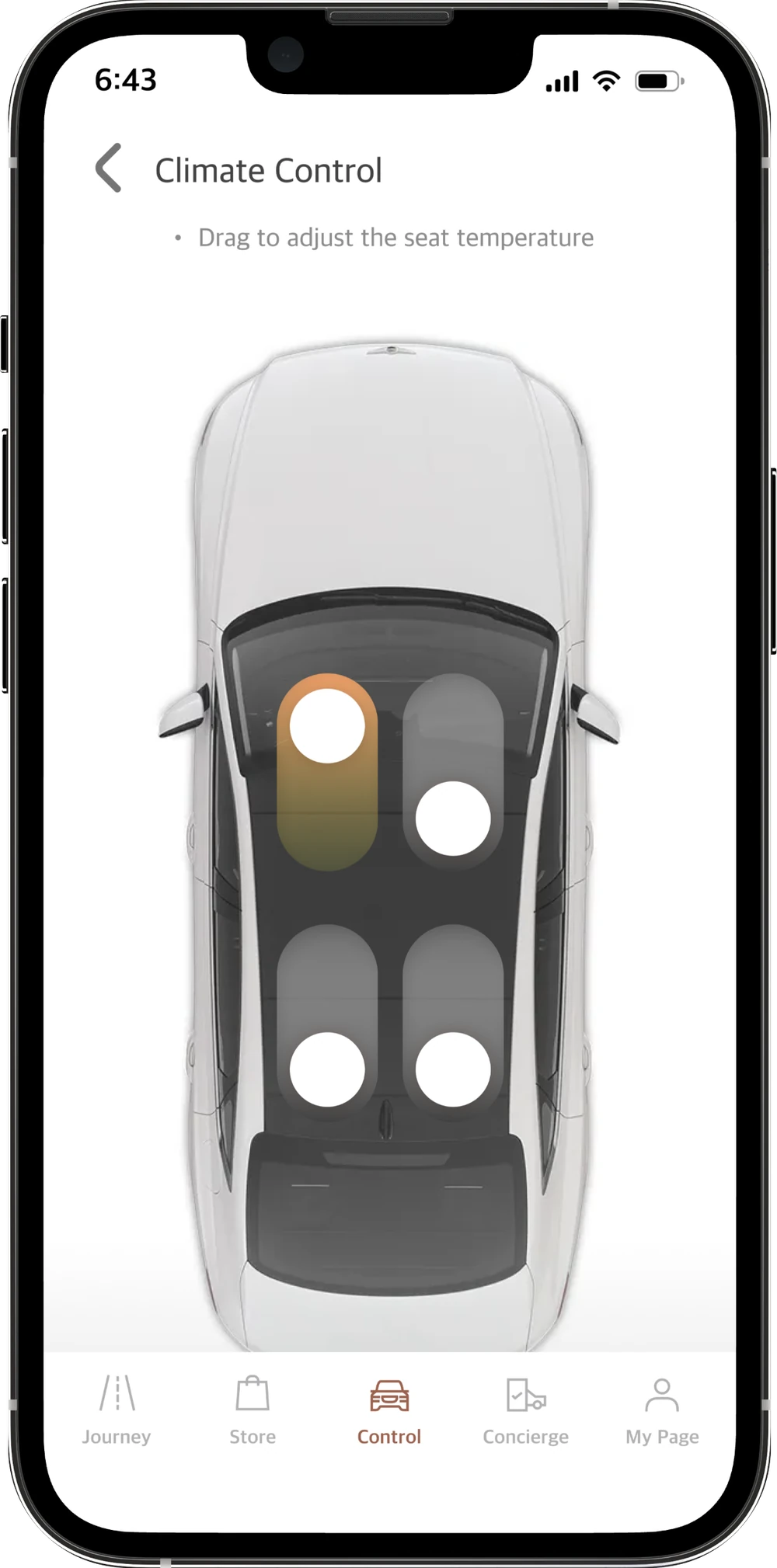
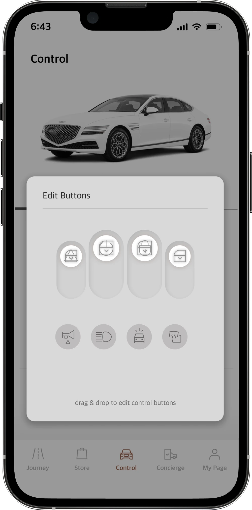
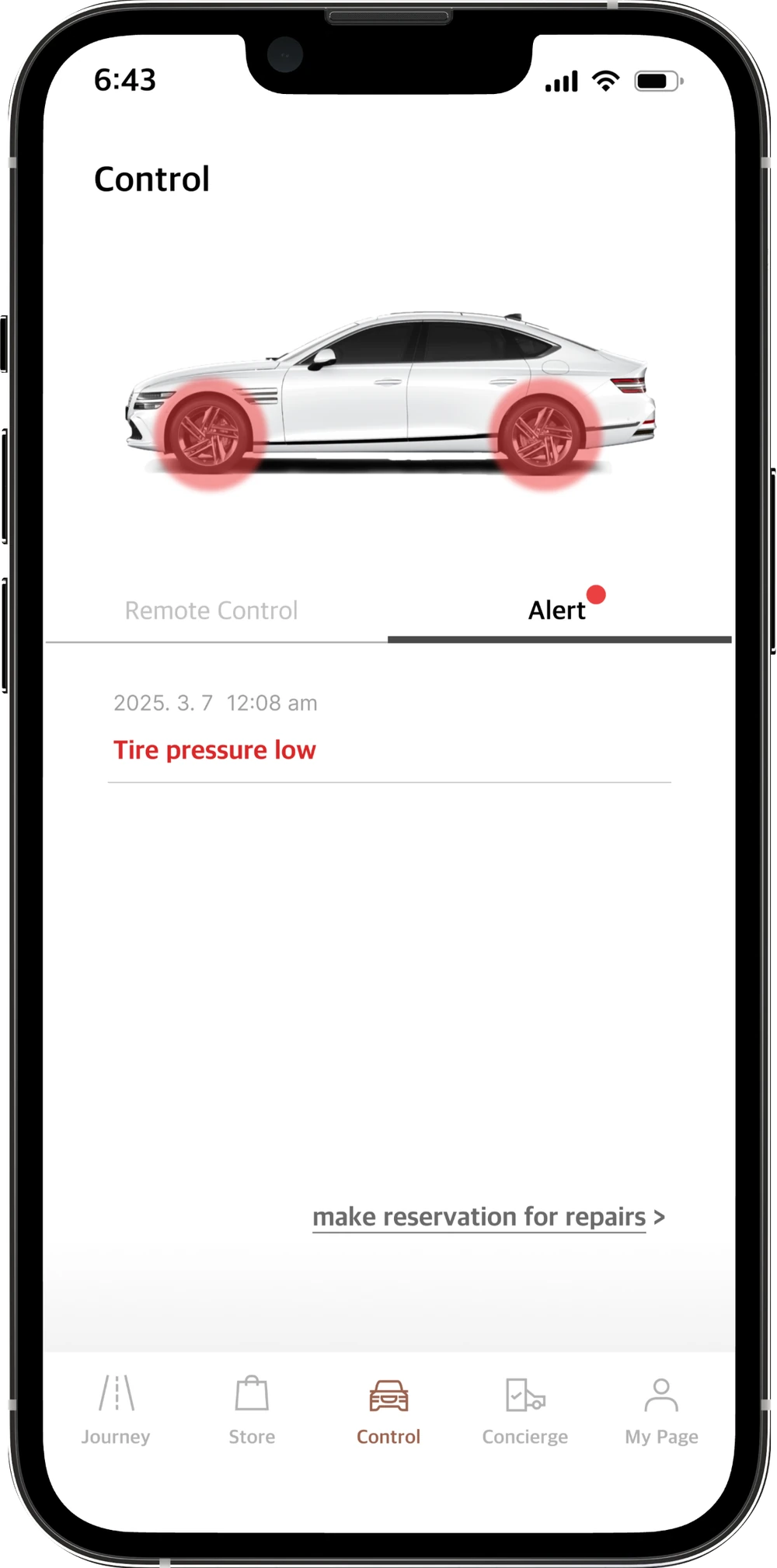
Every control in one place, in order of importance
The Control screen gets a clearer visual hierarchy and puts the most-used features first. Select each part to see it.
Feel the difference
Reviewers disliked holding a button for over a second to unlock. Try the original and the redesign.
Press and hold
Locked
Time to unlock –
Tap the toggle
Locked
Time to unlock –
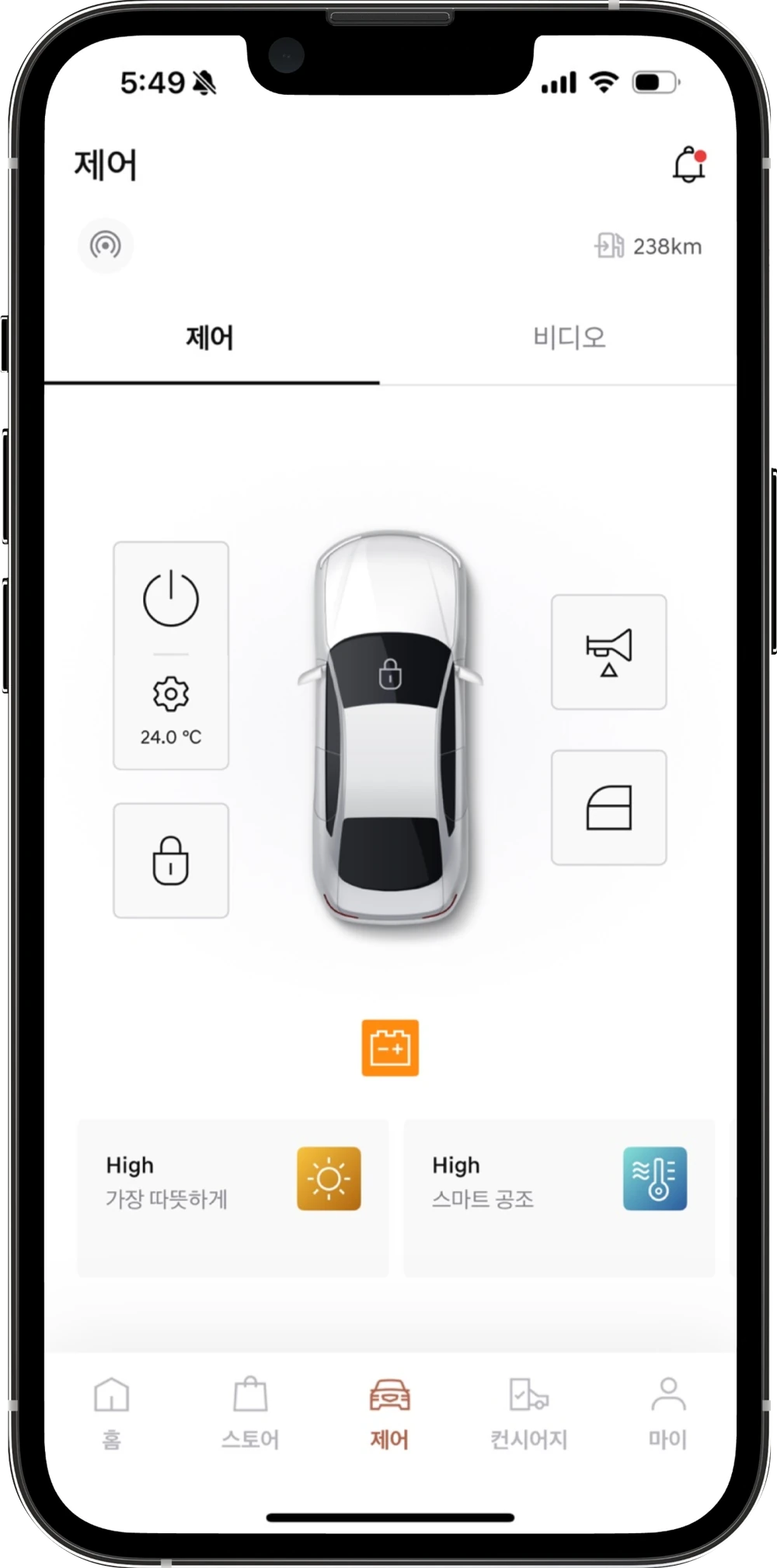
- Icons scattered around a top-down car
- Unlocking needs a press of over a second
- Repair alerts shrink to a small orange icon
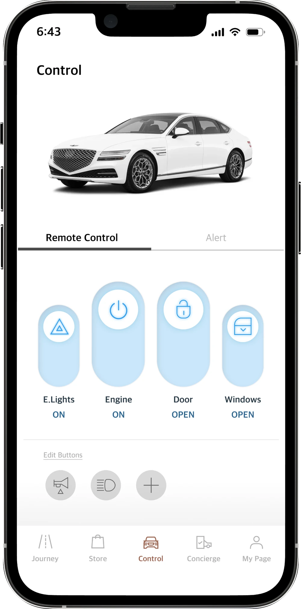
- Four toggles that show their state
- One tap to unlock or open
- Alerts get a tab of their own
06Reflection
What worked, and what I’d do differently
- What went well
- Using the app with a real, connected car let me experience its usability and accessibility firsthand.
- Talking with real users helped me understand their feedback in concrete terms.
- I could ground my research on the My Genesis UI in solid evidence.
- What I’d do better
- Interview and run feedback sessions with a wider range of users.
- Look into the app store reviews in more depth.
- Start with a firm visual system already in place.
- What I learned
- Prototyping gets better through many rounds of trial and error.
- Feedback from user interviews is essential.